Product Sail faced the challenge of creating a visual identity that clearly conveyed its dynamic approach to product marketing while also establishing a sense of trust and professionalism. The previous branding lacked a strong, memorable symbol that communicated progress, innovation, and digital-driven success.
The Solution
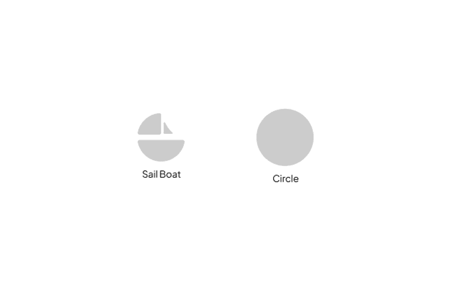
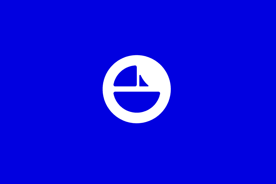
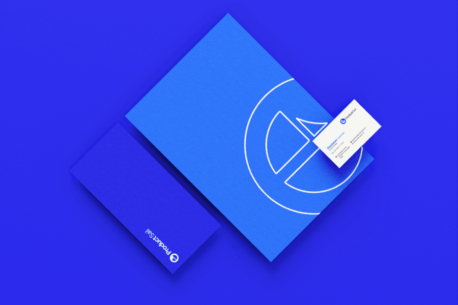
The Product Sail logo cleverly merges the concept of sailing with progress and digital marketing. The sailboat icon within a circular shape symbolizes navigation, growth, and forward movement—essential traits for a successful product marketing journey. The vibrant blue color conveys trust, reliability, and modernity, while the clean, bold typography reflects professionalism and innovation.