Brand identity design for a culinary haven in Plano
The project
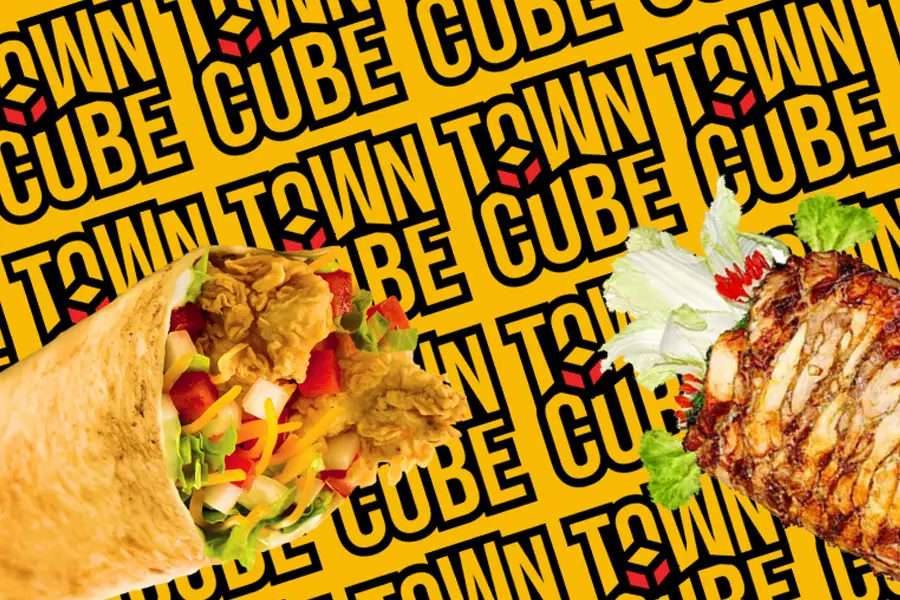
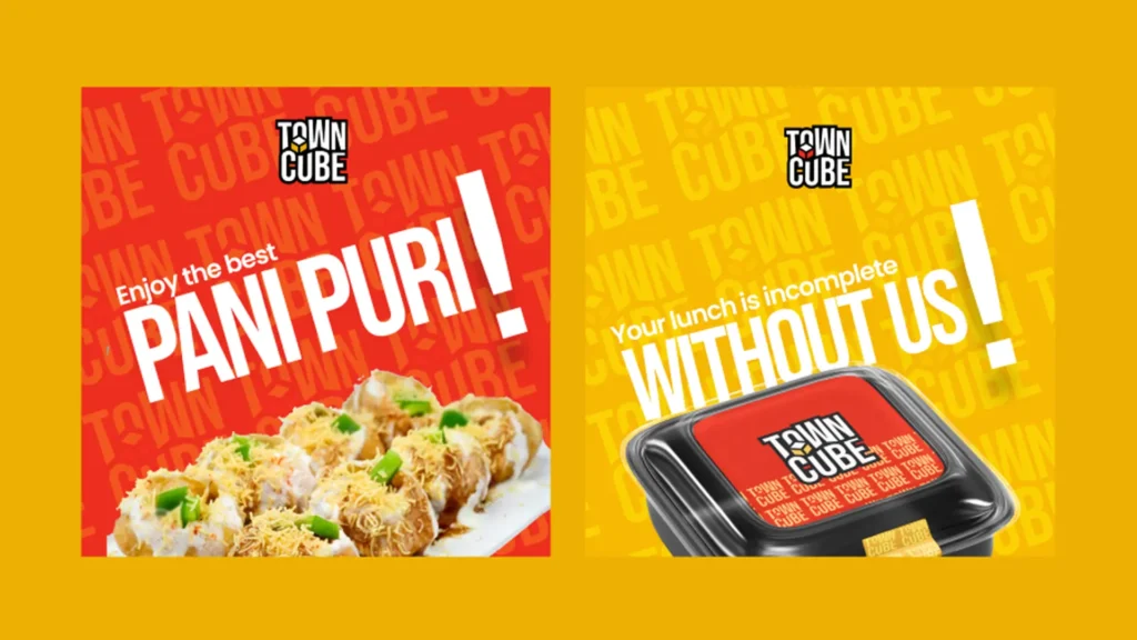
In the calm Plano neighborhood lies a culinary haven unlike any other. TOWNCUBE Restaurant. wanted to distinguish itself in a competitive dining landscape, capturing the attention of discerning diners amidst a sea of options? Towncube wanted a unique and memorable brand identity that communicates the core value of its brand to the lovers of tantalizing cuisines.
The Solution
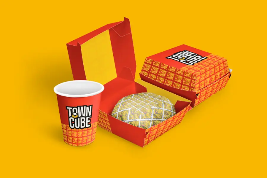
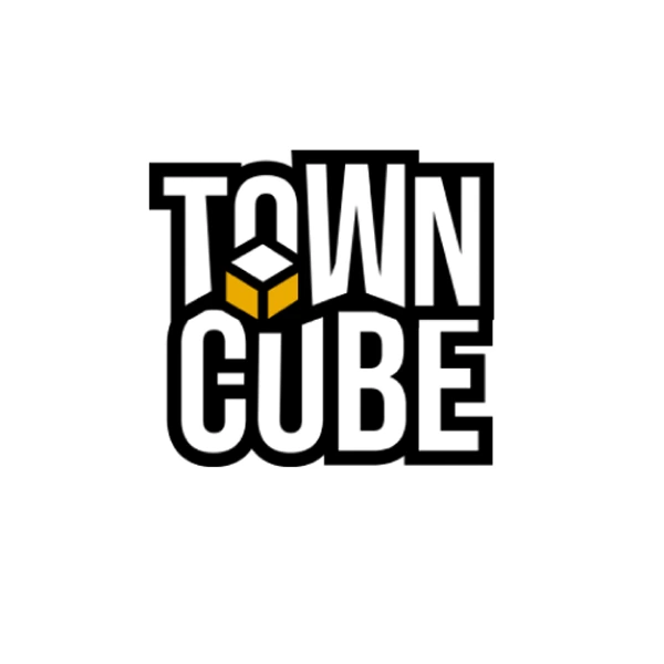
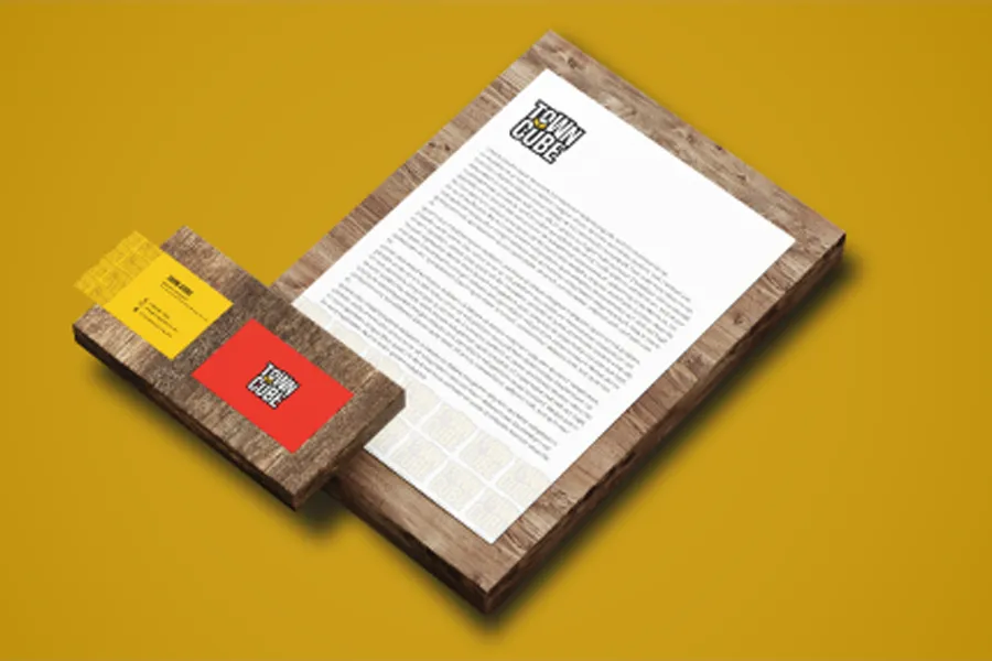
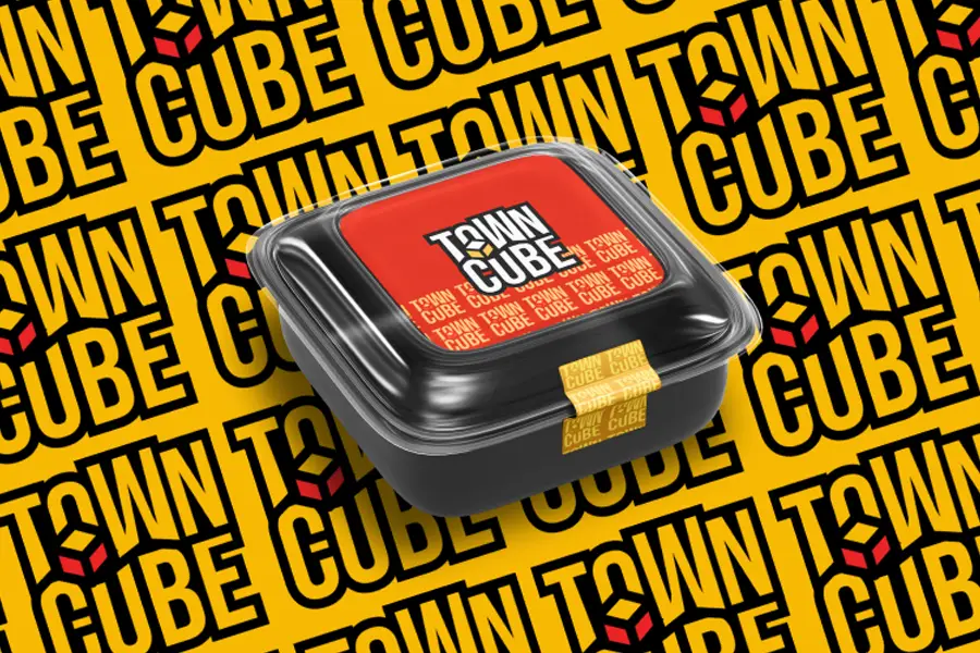
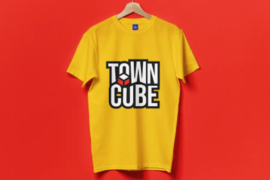
The TownCube logo blends bold typography with a cube element, symbolizing structure, balance, and a modern dining experience. The cube, partly colored in yellow represents food, warmth, and hospitality. The strong black outline enhances visibility, making it memorable. The design suggests a fusion of urban sophistication and a compact, welcoming space for customers.